StockCrowd
UX/UI design for the new Dashboard, Free-to-play subscription launch, Website creation tools, P2P Upgrades.
New Dashboard

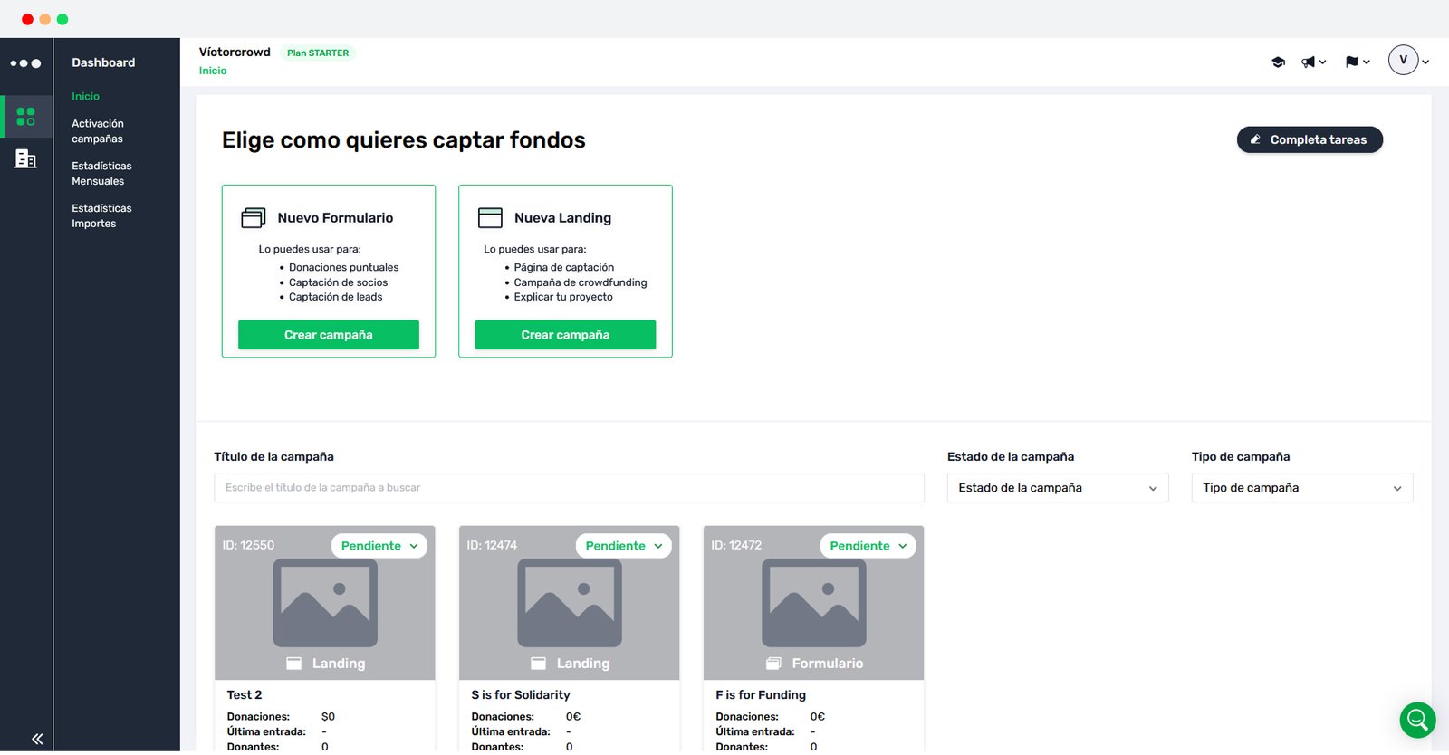
NEW Campaign creation in StockCrowd
Research & Ideation:
While implementing a feature addition to StockCrowd’s dashboard screen, I had the opportunity to have a closer look to some issues I noticed along the way.
The legacy dashboard had been in place for too long without revision, and there was potential for upgrades relating the inability to access aggregate information in a clear and consise way, functionalities that were taking too much space on screen, and subsequently longer user journeys for common tasks.
After sharing these thoughts and getting the green light, the team was able to deliver notorious improvements to the users while keeping development times to a minimum.
Design strategy:
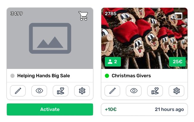
- Compact design — all the text based information was turned into visual, easily scannable bits. The gained space allowed to add new information, like latest updates for every campaign and direct access to preview, edition and donations info.
- Only display what’s needed — existing campaigns and campaign creation were made collapsable, focusing user’s attention and gaining much needed space for additional functionalities.
- Aggregate information — a new section where users can have an overview of their campaigns’ fundraising at a glance for the selected time period.

(1/2) NEW Dashboard in StockCrowd

(2/2) NEW Dashboard in StockCrowd

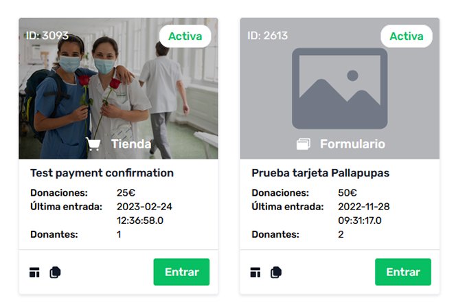
OLD Dashboard

NEW Campaign cards

OLD Campaign cards
User reception:
Due to the proactive nature of this project, there were no expectations set for the users. We were humbled by how many reached out to let us know how much they enjoyed the new features and overall feel of the new dashboard.
Donation box presets

(1/2) Donation box in StockCrowd

(2/2) Donation box in StockCrowd
Context:
StockCrowd’s fundraising campaigns all have a section for donation box configuration: custom amounts offered to the user, payment gateway info, gratitude messages, custom button colors, etc.
A new feature for a donation box preset was brought to the design department, so users would not need to start from scratch for all their campaigns.
The initial concept was for the donation box section to be replicated in the user settings to enable the user to create this default setup that would be used in new campaign creation.
Research & Ideation:
The usefulness of this change was clear, but the making an exact replica of the whole interface seemed wrong. Additionally, the user had to find this option in a completely different section.
One preset not enough, need for several presets would 100% be the next requested functionality.
The solution: a single expandable where users can select which preset to work with, and the option to select one of them as the preset.
Design strategy:
- Avoid replicating — while the design needs to keep system interactions consistent, it should avoid redundancies.
- Don’t stray the user off their path — every extra feature should live in the context where the user might find the need for it.
- Avoid unnecesary restrictions — any restriction in the design must respond to a real limitation.